Plot corpus coverage
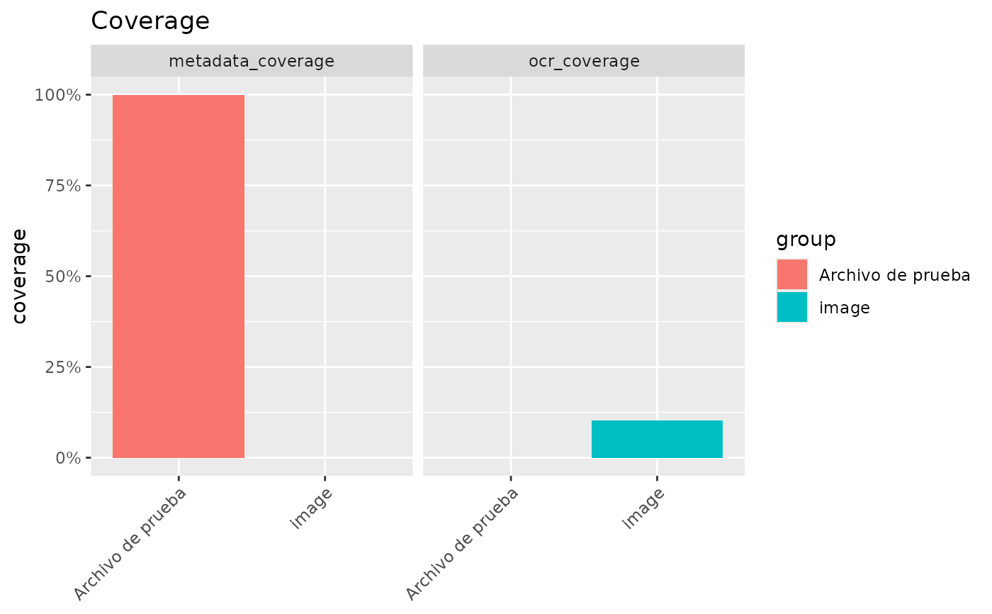
entropia_plot_coverage.RdPlots the output of entropia_corpus_quality() – coverage proportions per
metric and group – as a bar chart. With a single metric the chart is a
plain bar chart of the coverage proportion by group; with several metrics the
bars are faceted by metric, each panel carrying its own groups and y scale.
Arguments
- x
A data frame or tibble with
metric,groupandpctcolumns, e.g. the output ofentropia_corpus_quality().- metric
Optional character vector of metric(s) to plot, a subset of
unique(x$metric).NULL(default) plots all metrics.
Details
The y axis is labelled as a percentage. pct is NA for groups with no
total (e.g. a metric absent from a corpus); those bars are dropped by
ggplot2 like any NA aesthetic.
Examples
q <- data.frame(
  metric = c("ocr_coverage", "metadata_coverage"),
  group = c("image", "Archivo de prueba"),
  n = c(250L, 3L),
  total = c(2428L, 3L),
  pct = c(250 / 2428, 1)
)
p <- entropia_plot_coverage(q)
if (requireNamespace("ggplot2", quietly = TRUE)) {
  p + ggplot2::labs(title = "Coverage")
}