Plot entity frequencies
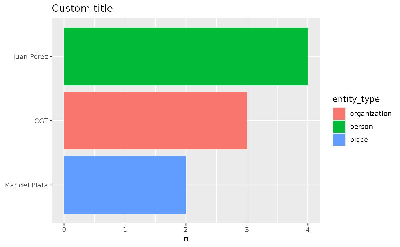
entropia_plot_entities.RdPlots the output of entropia_entity_frequency() as a horizontal bar chart
of the top entity values, filled by a column of x (by default
entity_type). value is reordered by count so the most frequent entity
sits at the top of the chart (via coord_flip()).
Arguments
- x
A data frame or tibble with
valueandncolumns (and typicallyentity_type), e.g. the output ofentropia_entity_frequency().- top
Number of top rows (by
n) to plot. Default10.- fill
Column of
xto colour the bars by, selected by name or bare. Default"entity_type".
Examples
freq <- data.frame(
  entity_type = c("person", "organization", "place"),
  value = c("Juan Pérez", "CGT", "Mar del Plata"),
  n = c(4L, 3L, 2L)
)
p <- entropia_plot_entities(freq)
if (requireNamespace("ggplot2", quietly = TRUE)) {
  p + ggplot2::labs(title = "Custom title")
}