Plot a temporal profile
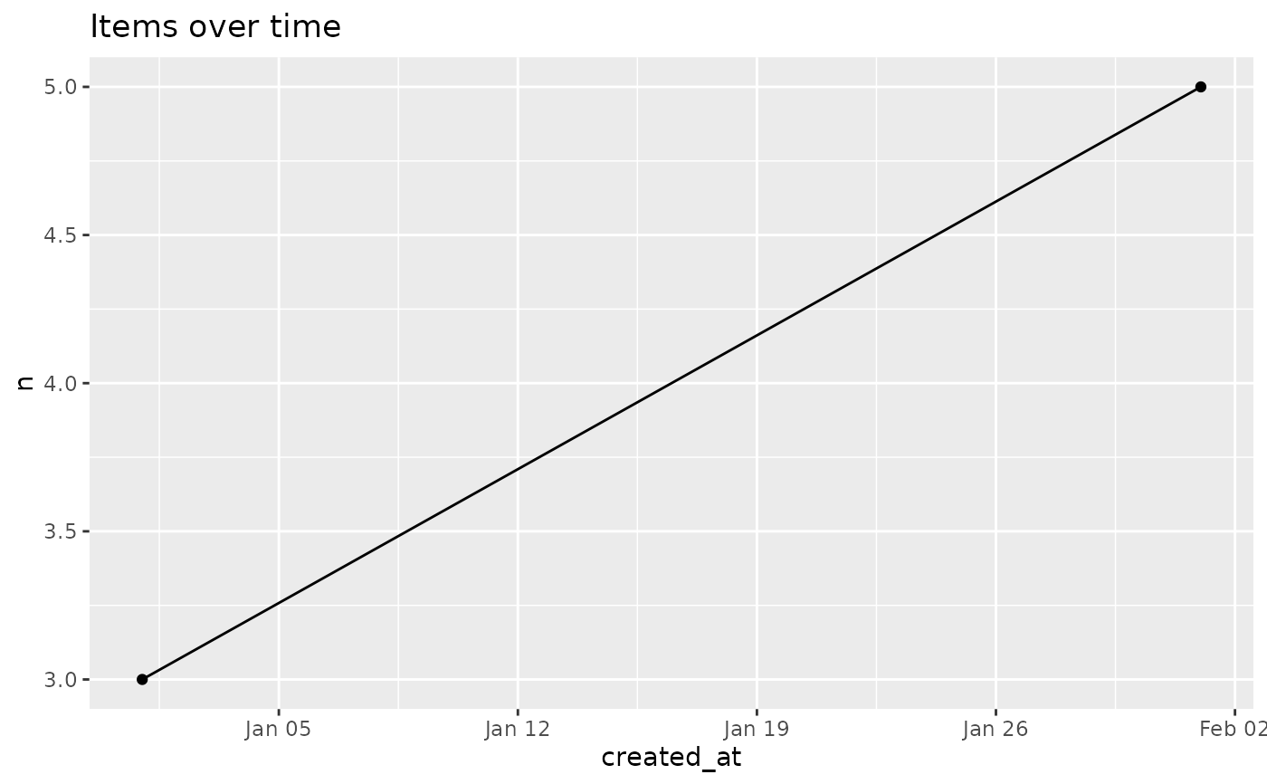
entropia_plot_temporal.RdPlots the output of entropia_temporal_profile() – counts per time bucket
– as a line chart. The date column is auto-detected when x carries exactly
one POSIXct/Date column (the bucket); pass date_var when the profile
carries several date-like columns (e.g. grouping columns that are themselves
dates).
Arguments
- x
A data frame or tibble with a
ncount column and a date column, e.g. the output ofentropia_temporal_profile().- date_var
Optional date column to plot on the x axis, selected by name or bare (tidyselect).
NULL(default) auto-detects the single date column ofx.
Details
The returned ggplot is deliberately bare: add labels, a title, a theme or
facets with +. A profile built with a by grouping draws one line across
all groups; add aes(colour = <group>) yourself to distinguish them.
Examples
prof <- data.frame(
  created_at = as.POSIXct(c("2026-01-01", "2026-02-01"), tz = "UTC"),
  n = c(3L, 5L)
)
p <- entropia_plot_temporal(prof)
if (requireNamespace("ggplot2", quietly = TRUE)) {
  p + ggplot2::labs(title = "Items over time")
}